Cracked
The first entertainment business in downtown Kent (my alma mater) asked me to develop its core brand identity! The company’s immersive, movie set-style escape rooms were a wellspring of ideas for the project.
To capture the eccentric personality of puzzle enthusiasts, the logo builds off of the iconic magnifying glass motif, followed by a warped typewriter font.
Inspired by regal, velvety theatre curtains with golden rope ties, I created Cracked's palette to feel secretive and exclusive.
The business opened with 3 highly-themed escape rooms that each needed a stamp design (see above).
I also developed this logo animation for the business to use on its social channels to promote the opening.
Here's a banner design I created for Cracked's external signage around its building.
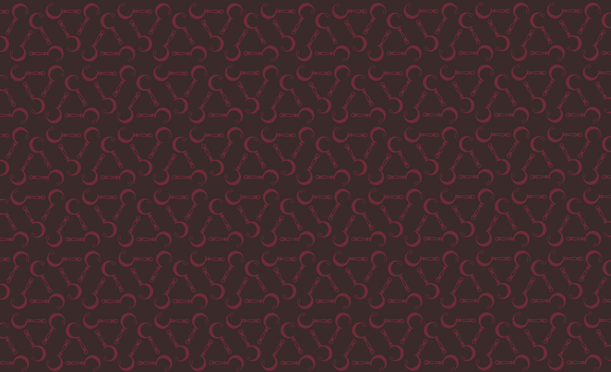
We ended the project with a few pattern designs (below), to use in the background of collateral like these business cards (above) and their site.


This project includes some of my favorite palette and pattern designs to-date! I was thrilled at how well-received the branding was within the surrounding community and can’t wait to visit their escape rooms again!


