Outside Studios
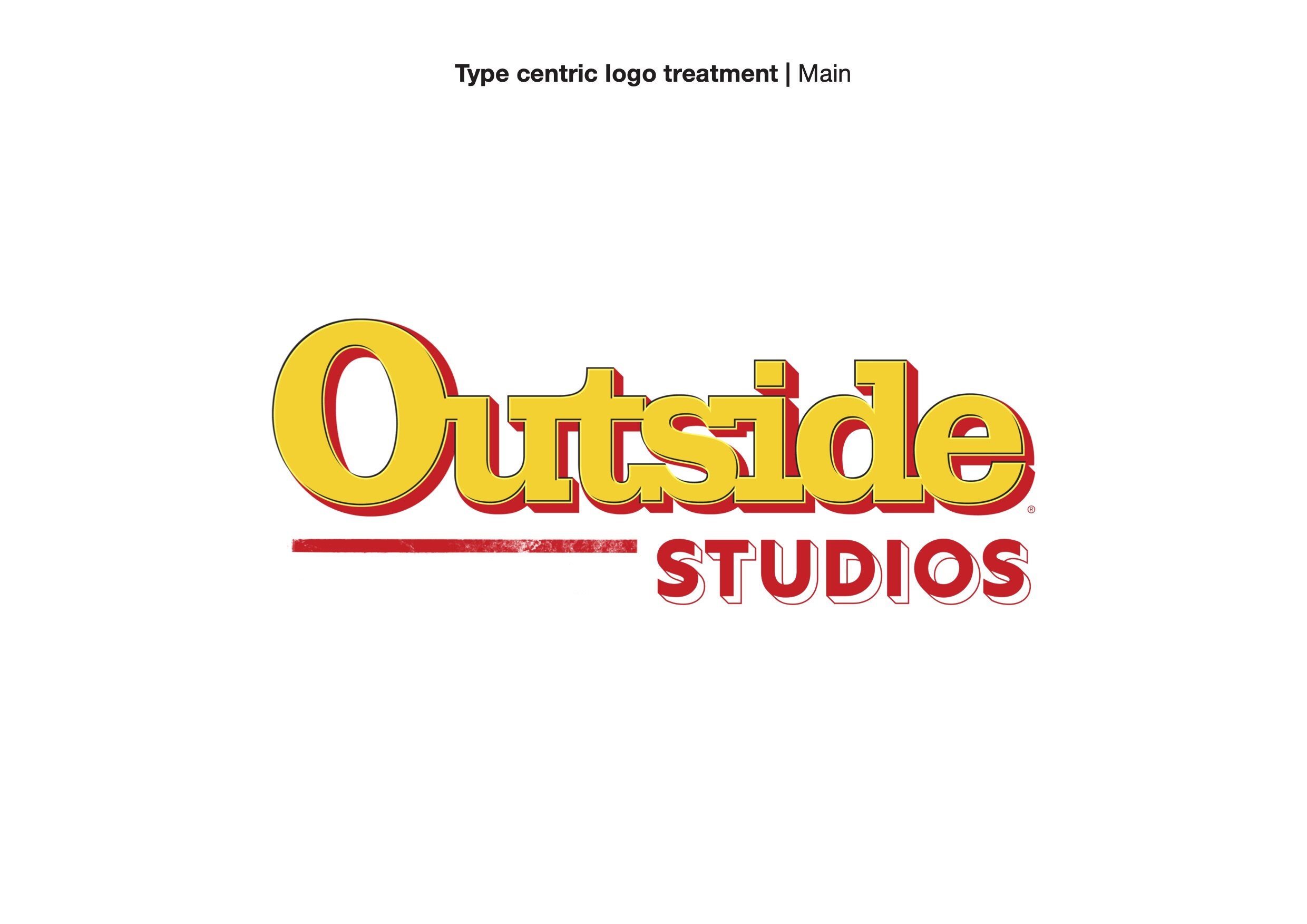
When Outside Magazine's internal design studio reached out for a logo, I knew that a design challenge was ahead! They already had an established magazine and logo with a history behind it. So, the studio’s mark would have to pay homage to its forerunner.
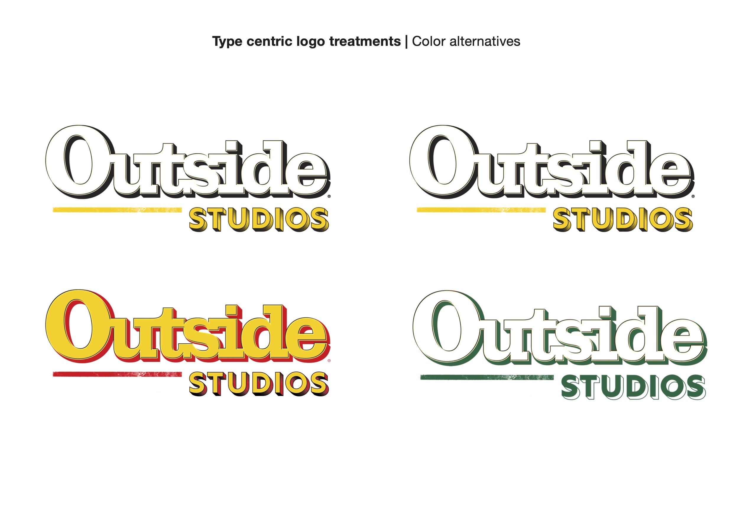
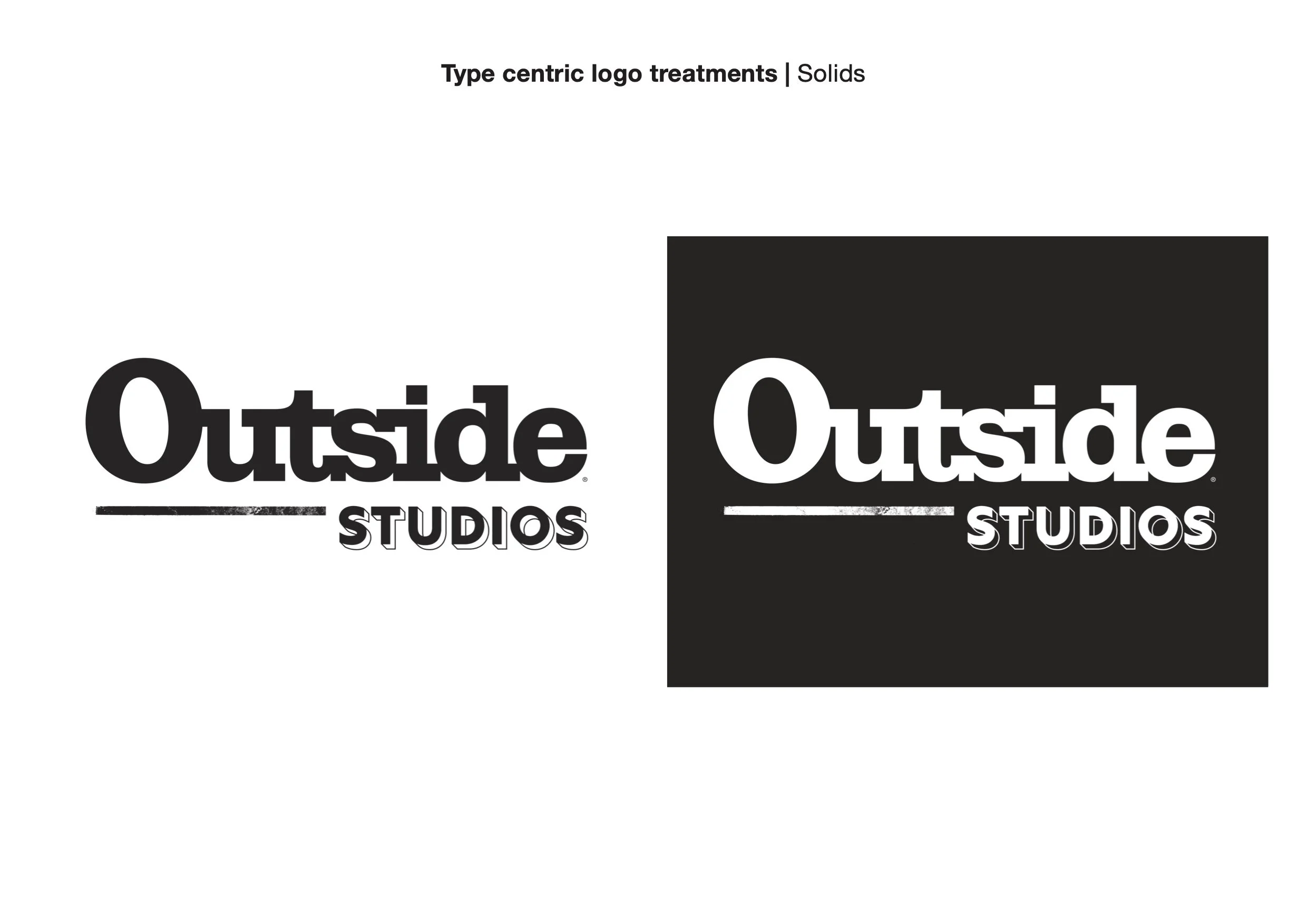
I used letterforms inspired by Outside’s logo, as well as a similar line weight, to keep the logo feeling familiar.
Parent Brand Logo:
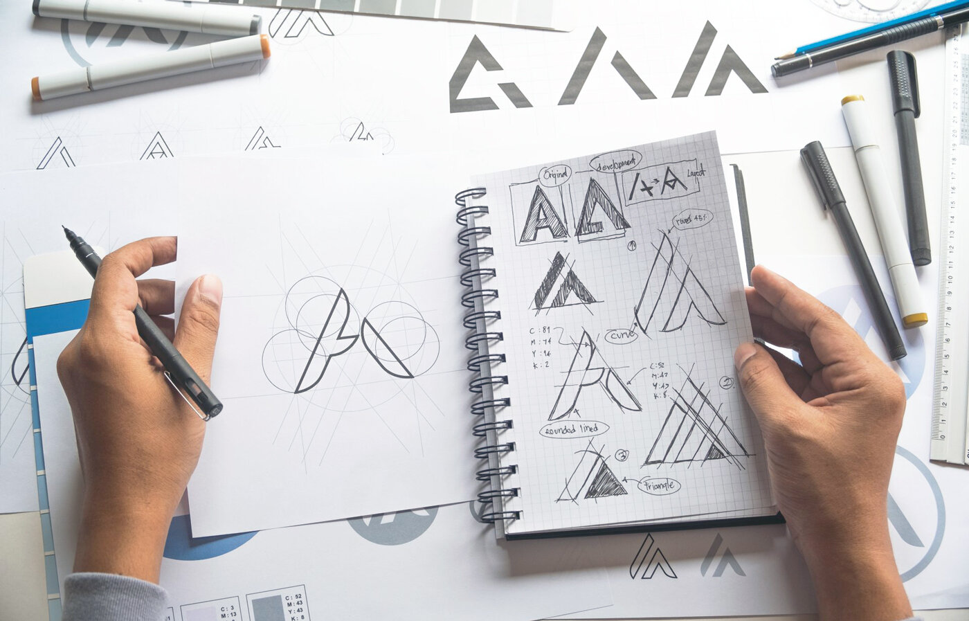
Below: Initial Concepts for R1+R2
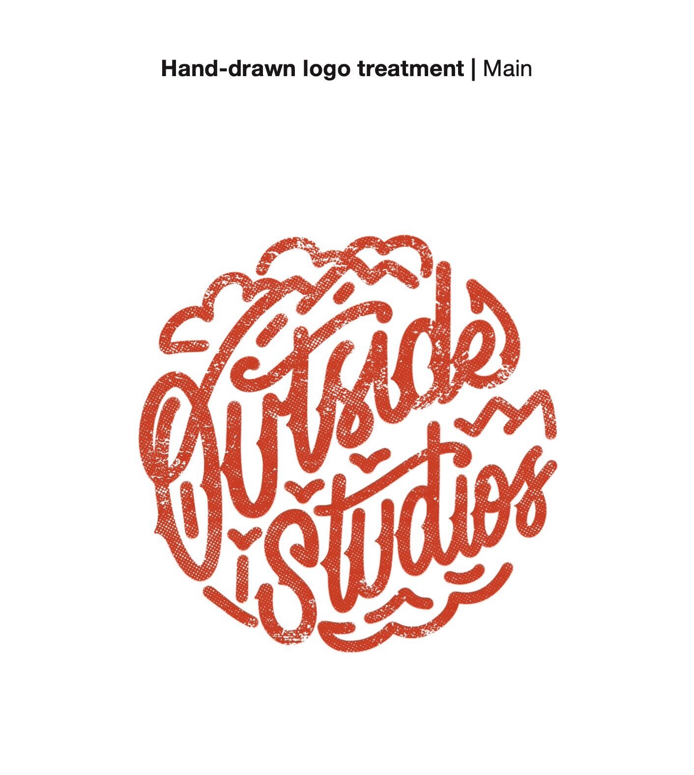
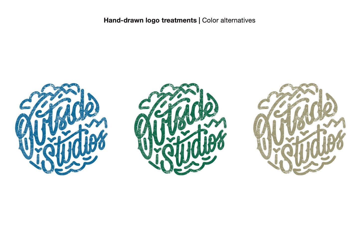

To create a classic, youthful camp charm, I used hand-lettering to keep it human and linework (inspired by dirt tracks, mountains, and birds) to capture the energy of the outdoors!
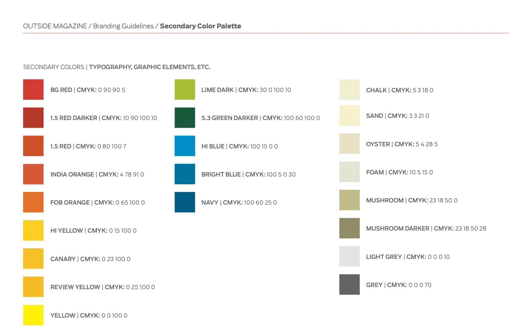
The client requested a comprehensive set of color variants. This full set acts as way for them to differentiate their coverage of sports, people, places, adventure, discoveries, health and fitness, gear and apparel, trends and events.
Creating this full collection of color combos allowed the client to have flexibility with high or low contrast scenarios. They could tone it back when they need a watermark or amp it up for some striking brand signage.
I was delighted when the client chose the more illustrative concept to pursue! It gave me the perfect chance to practice melding my hand-lettering into a zany combo of slab-serif and script.


