
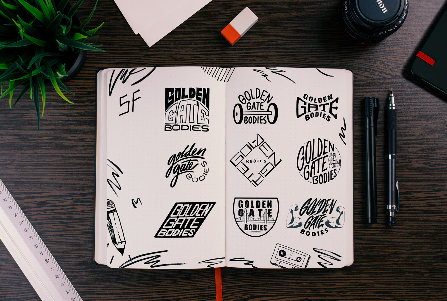
Golden Gate Bodies
A San Francisco group fitness instructor approached me at the beginning of the COVID-19 pandemic with a growing interest in outdoor, personal training and a need for a brand identity overhaul!

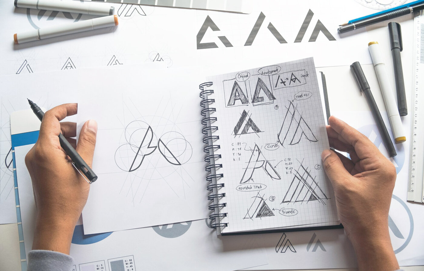
The final mark (above) was a result of a few rounds of container shape explorations and type experiments (below). In the end, the medicine ball shaped badge worked best!

Above, you can see some hand-drawn sketches and early digital concepts. Below, Is the final mark, color palette, and font pairing.


The small charm on top of 'Golden' is a crown that doubles as a sunrise. This crown jewel represents the best you can be, as well as the dawn of your new body transformation!

We ended the project with some examples of what his branding would look like out in the wild, whether it's on athletic gear or signage!

I loved getting the chance to use the infamous Golden Gate red in a branding! This project was also a great chance to test my text-wrapping abilities!
More Branding Work
